I joined Haaretz in 2020 to build visual and interactive journalism. In the years that followed, the war dramatically expanded the scope of that work. These three maps reflect that shift: attempts to transform fragmented, fast-moving events into coherent stories grounded in data, design, and careful reporting.
Mapping the October 7 attack
Read the article → October 7: How Hamas Attacked Israel Minute by Minute
This investigation was Haaretz’s first large-scale, minute-by-minute reconstruction of the October 7 attack. More than a dozen reporters spent months gathering timelines, videos, photographs, and audio recordings to assemble the most complete account possible. With so many parallel events unfolding across dozens of sites, it became clear early on that the story needed a map - a single, top-down framework capable of holding the scale and simultaneity of that day.
Visual & Storytelling Decisions
From the earliest pitch meetings, I argued for a scroll-driven structure in which the reader’s motion through the page would directly correspond to time. Every pixel scrolled would advance the narrative by a fixed, measurable unit. It was an approach designed to make the chaos of the day legible - to let readers feel the simultaneity of events rather than simply read about it.
The idea was met with understandable skepticism. How do you “direct” a narrative that must follow a rigid timeline? What happens during long stretches of inactivity, or in moments where too much happens at once?
The only way forward was to build it. A working prototype became the proof of concept the project needed: real events plotted onto a living map, advancing in time as you moved through the page. That prototype eventually became the backbone of the published piece, shaping both the editorial structure and the visual rhythm of the story.
Technical Approach & Challenges
I started by surveying existing 3D mapping and storytelling tools, but none offered the precision we needed for scroll-based timing, camera control, or event placement. The story demanded full flexibility, so I built the system from scratch.
At the center of it was a custom SVG map georeferenced to real-world coordinates. I wrote a conversion algorithm so editors could paste latitude–longitude pairs and have events automatically appear in the correct position. Each event carried a timestamp, and each article section defined a specific time window, allowing scroll position to map cleanly onto the unfolding timeline.
Directing the camera was the final challenge. I created a sandbox exposing all CSS 3D transform variables, allowing me to test angles, zoom levels, and rotations until each transition felt clear and purposeful. Those values were then applied to the main map to guide readers smoothly through the day’s events.
Insights & Impact
This map-based reconstruction did more than visualize data - it became a tool for comprehension. By presenting a minute-by-minute, geolocated narrative of October 7, the piece gave readers in Israel and abroad a way to grasp the scale, simultaneity, and human tragedy of the attack. It provided a structured, immersive account at a moment when events felt overwhelming, chaotic, and deeply painful.
For me, the project became a turning point. It reinforced the importance of trusting my initial instincts - in this case, that time-based scrolling was the right narrative spine, even when the idea seemed risky or impractical. It also showed me the power of building custom sandbox tools to shape stories that cannot be told with off-the-shelf platforms. And on a deeper level, it brought together my two crafts - cinematography and coding - into a new way of directing a narrative through space, time, and movement.
This piece laid the groundwork for everything that followed, influencing both the technical approach and the storytelling tone of the next two map investigations.
Road to Redemption
Read the article → Road to Redemption: How Israel’s War Against Hamas Turned Into a Springboard for Jewish Settlement in Gaza
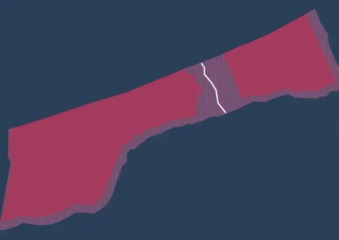
This investigation was fundamentally different in structure and intention from the October 7 reconstruction. Instead of tracking simultaneous events across dozens of locations, the reporting focused on a single, charged geography: the Netzarim corridor - a 38-square-kilometer strip of land that, during the war in 2024, was held by the IDF and effectively bisected Gaza. The piece examined how Israel’s religious right sought to use this new military reality to revive the pre-2005 settlements that had once existed in the Strip.
The narrative spine was clear from the start. Whereas the October 7 map asked readers to scroll through time, this story asked them to scroll through space. The Netzarim road became the backbone - a physical axis that, during the war, divided Gaza and was lined with newly established military bases. Structurally, it functioned like a road movie: readers were led along the corridor, stopping at key points to reveal the activities, imagery, and political implications unfolding there. Moving along the road was, in effect, moving through the story.
Visual & Storytelling Decisions
With a single, linear geography to work with, I leaned into a more cinematic approach. Instead of building a dynamic, scroll-rendered map, I used Google Earth to create controlled camera flights between stops along the Netzarim road. These transitions - built on real, high-resolution satellite imagery - allowed readers to “travel” the corridor as if looking out of an aircraft window. It grounded the story in the literal terrain of Gaza.
Haaretz had obtained exceptionally up-to-date satellite imagery of the corridor, which I layered over older Google Earth basemaps to reveal how dramatically the landscape had changed. To help readers compare these moments in time, I built a scroll-to-reveal component: as you moved along the road, the older satellite layer peeled away to expose the newer one, revealing destroyed roads, demolished buildings, and military installations in real time.
One of the most meaningful elements for me was a three-layer reveal of the former Israeli settlement of Netzarim. First I showed the area in 2003, just before the disengagement; then the same land in 2023, rebuilt by Palestinians; and finally its appearance in 2024, after bombardment and ground operations had all but erased what was there. Seeing these layers stack and collapse onto one another - past, present, and post-war reality - created a kind of digital excavation. It offered a compressed way of understanding the story of this land: the removal of settlements, the emergence of new communities, the devastation of war, and the renewed push for re-settlement.
“It’s gripping. It’s another way to look at the situation in Palestine… brilliantly executed… The narrative comes first, the innovation supports the narrative in a way that makes it so strong.”
Judges’ Statement, 2024 European Press Prize – Innovation Award (Runner-up)
Working on this piece deepened my understanding of how scroll-based, map-driven storytelling can function much like a film. By shaping camera paths, layering imagery, orchestrating reveals, and controlling pacing and framing, I learned how to guide a reader’s journey even as they control the pace of the narrative. It’s where my two crafts - cinematography and coding - fully intersected to build a spatial, cinematic form of journalism.
Erased
Read the article → Erased - Israeli Settlers’ Brutal War on Palestinian Communities in the West Bank
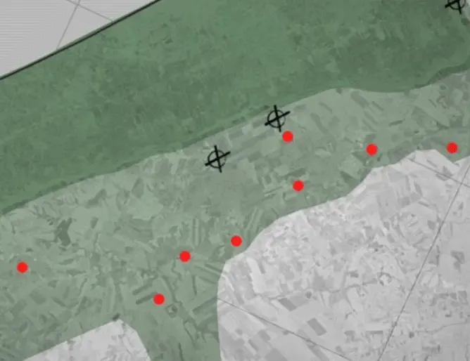
Erased investigates the systematic displacement of Palestinian communities in the West Bank through settler intimidation and violence. The challenge was to tell this story on two distinct scales. On the macro level: dozens of displaced communities, hundreds of settler outposts, and an escalating system of coercion. On the micro level: the lived experience of a single community forced from its land. From the outset, the piece was structured to move deliberately between these perspectives, making both the scope of the process and its human cost legible.
Visual & Storytelling Decisions
I designed the article to alternate between scale and intimacy rather than collapse them into a single view. The story opens with satellite before-and-after imagery of a community - intact in one layer, erased in the next - establishing the stakes visually before expanding outward.
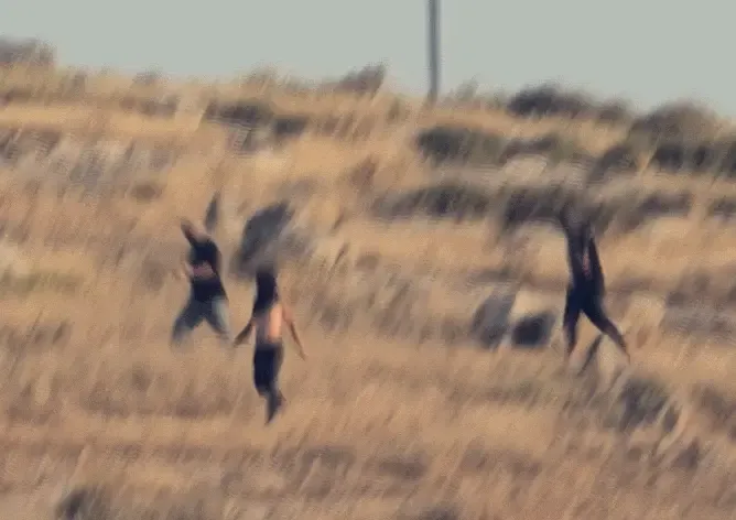
From there, a three-dimensional, scroll-driven map reveals the broader geography of displacement: settler outposts, access roads, fortified areas, and pressure points across the West Bank. Flight transitions and camera movement are used to expose patterns that emerge only at scale. Once those patterns are established, the narrative narrows again - focusing on the expulsion of Mughayyir al-Deir, north of Jerusalem - where the same tactics are traced through drone footage and testimony from Ibrahim Muhammad al-Malihat, the community’s former leader.
Method & Innovation
As lead interactive developer, I treated cartography not as illustration but as an investigative tool. Working with spatial datasets from Kerem Navot and Peace Now, I translated complex reporting into an interactive system that reveals how displacement operates as a coordinated process rather than a series of isolated incidents.
The result is a visual investigation that makes a slow, normalized form of violence visible - and difficult to dismiss.
A Spatial Storytelling Practice
Taken together, these three investigations trace a single arc of practice: moving from event reconstruction, to spatial narrative, to systemic exposure. Each project builds on the last, expanding the scale and ambition of the work — from reconstructing a single day, to navigating a contested geography, to revealing a coordinated process unfolding across an entire region.
Reach & Recognition
Each project reached large audiences in Hebrew and English and informed public, journalistic, and academic conversations in Israel and abroad. Road to Redemption was the first investigation to visually connect the war in Gaza to the growing movement to resettle the Strip, gaining wide traction across the political spectrum and later earning a runner-up award for Innovation at the 2024 European Press Prize.
Together, these projects define how I approach visual journalism: using custom tools, spatial data, and cinematic structure to guide readers through complex realities without fixing their pace. They reflect a practice built on iteration, collaboration, and the belief that visual and interactive journalism can do more than explain events — it can reveal systems, relationships, and the forces shaping people’s lives.